Best Curtain Colours for Blue Walls Top Color Combinations & Styling Tips
• By Anamika
• 2025-12-05
• 9 mins read
The best curtain colours for blue walls are white, off-white, beige, taupe, blush, soft pink, mustard, gold, terracotta, charcoal, light grey, navy, sage green, olive, forest green, warm neutrals, and textured off-whites. These colours either complement the cool tone of blue or create a warm balancing contrast.
This guide helps you match your exact blue shade with the right curtain colours, decide whether curtains should be lighter or darker, and choose colours based on the mood you want your space to reflect.
Understand the Shade of Blue on Your Walls
Blue appears in a wide spectrum-from airy pastels to rich navies. The undertone (grey, green, or violet) also changes how curtains look against it. Understanding your wall shade helps you choose curtain colours that balance or enhance the vibe of the room.
1. Baby Blue
A soft, powdery blue with gentle white undertones. It creates a peaceful, airy feel-perfect for soothing bedrooms, nurseries, and Scandinavian-style living rooms.
2. Sky Blue
A clear, bright blue that reflects freshness and openness. It feels vibrant but still calming, ideal for coastal or minimal homes.
3. Steel Blue
A muted blue with a grey cast. This shade feels grounded, contemporary, and sophisticated without being too dark.
4. Pastel Blue
A soft, icy blue that looks fresh and modern. Works beautifully in small rooms because it reflects light.
5. Denim Blue
A mid-tone blue with slight grey undertones. It has a relaxed, lived-in aesthetic-warm enough for cosy décor and modern enough for urban interiors.
6. Teal Blue
A deep blue with green undertones. It feels luxurious, bold, and expressive, adding a rich visual depth that makes any space feel more dramatic, artistic, and thoughtfully designed.
7. Navy Blue
A rich, dramatic blue that adds depth and intensity to any room. A favourite for bedrooms, offices, and statement living rooms.
8. Royal Blue
Bright, vivid, and energetic, this shade is expressive and instantly draws attention. It lifts the visual energy of the room, making the space feel lively and full of personality.
9. Indigo Blue
A deep, moody blue with violet undertones. It gives elegance and a sense of mystery to interiors, creating a dramatic atmosphere that feels visually captivating.
10. Slate Blue
A grey-blue with a cool, modern tone. Works extremely well with both warm and cool curtain colours.
What Curtain Colours Look Best With Blue Walls?
Blue walls pair beautifully with both cool and warm colours depending on the effect you want. Warm shades balance blue with softness, while cool tones amplify its calmness making it easier to choose curtains for home that match your style.
1. White Curtains
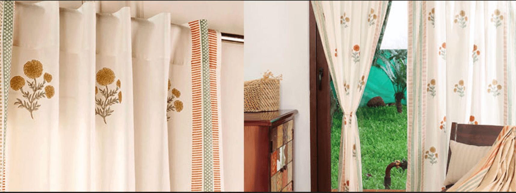
White is the most universally flattering curtain colour for any shade of blue. It brightens the room, softens darker blues like navy or teal, and makes pastels feel airy. White curtains also highlight architectural details and create a clean, timeless look. Semi-sheer white styles, especially those with a delicate handcrafted finish like the handwoven Chanderi curtain, enhance this lightness even further and keep blue walls feeling open and refined.
2. Cream & Beige Curtains
Cream and beige add warmth that beautifully balances the coolness of blue walls. They soften navy, steel, denim, and slate blue while creating a cosy, elegant feel. These colours are perfect for living rooms and bedrooms that need warmth without losing sophistication.
3. Light Grey Curtains
Light grey enhances blue walls by keeping the palette modern and minimal. It works well with baby blue, slate blue, denim, and royal blue. Grey curtains subtly reduce intensity without taking attention away from the wall colour.
4. Charcoal Curtains
Charcoal adds structure and visual depth to lighter blue walls. It makes pastel blue look crisp and modern and creates a strong, premium contrast with sky blue or powder blue. A refined example of this look is the Off-White & Charcoal Handwoven Cotton Striped Curtain, where the subtle charcoal detailing brings balance and quiet sophistication to soft blue spaces.
5. Warm Neutrals (Taupe, Sand, Linen Beige)
Warm neutrals balance blue with earthy warmth. Taupe and sand work beautifully with steel blue, denim, navy, and teal because they ground the palette and prevent the room from feeling too cold.
6. Blush & Soft Pink Curtains
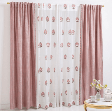
Blue and pink are complementary colours on the colour wheel, giving a natural harmony. Blush curtains soften dark blue walls (navy, indigo, teal) and add a gentle warmth to baby blue or pastel blue interiors. This combination feels modern, fresh, and slightly romantic. Curtains in soft dusty pink with balanced off-white detailing, like the one with ornate florals and bold stripes, enhance this harmony beautifully by bringing in warmth without overwhelming the blue.
7. Mustard & Gold Curtains
Mustard creates a high-contrast, warm pairing with deep blue walls like navy, slate, denim, and indigo. It adds richness, drama, and a subtle vintage charm. Gold curtains elevate teal, steel blue, and slate blue walls with a luxe finish. A palette that blends ivory, rust, mustard, and teal such as the handwoven curtain from the Marigold Collection brings this warmth and contrast together beautifully, adding character without overwhelming the room.
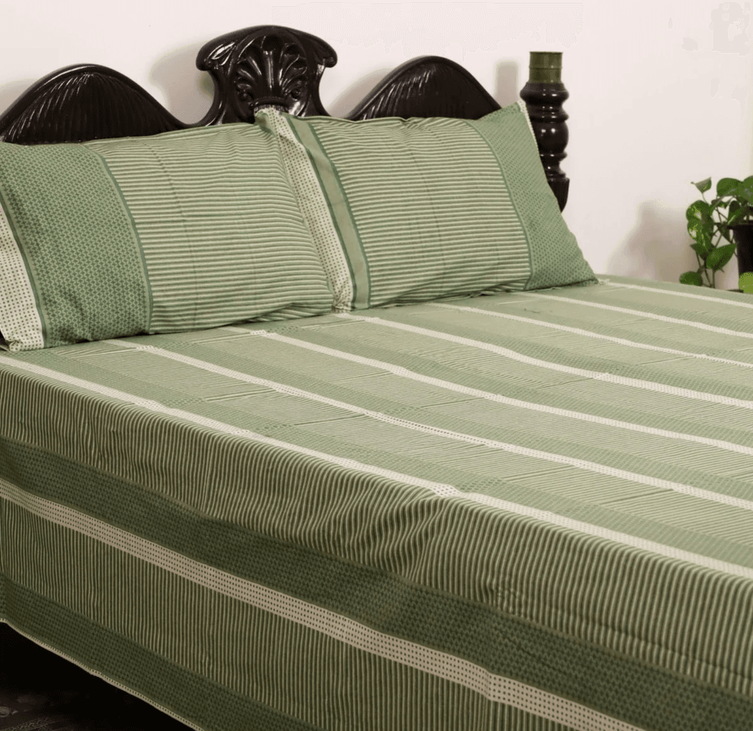
8. Sage Green & Olive Green Curtains
Green is a beautiful partner to blue because the tones naturally blend with soft contrast. Sage and olive create an earthy, serene palette. They pair especially well with sky blue, slate blue, teal, and denim. This combination feels calm, nature-inspired, and balanced.
9. Forest Green Curtains
For bold, expressive interiors, forest green against navy or teal creates a rich, boutique-style finish. The combination feels layered and luxurious, often seen in modern luxury homes.
10. Navy Curtains
Tone-on-tone pairing works beautifully with navy, slate, denim, and royal blue walls. Navy curtains create a dramatic, unified, premium backdrop-especially effective in large living rooms or bedrooms where depth is desired.
11. Terracotta Curtains
Terracotta adds warmth and earthiness, making cool blue walls feel more inviting. It works beautifully with steel blue, slate blue, denim, and pastel blue by providing visual contrast without clashing.
Should Curtains Be Lighter or Darker Than Blue Walls?
The choice depends entirely on the atmosphere you want. Lighter curtains like white, cream, off-white, or linen beige make the room look bigger and brighter. They soften dark blues and amplify the freshness of light blues. Darker curtains like charcoal, navy, forest green, or deep taupe add contrast and structure. They create a premium, dramatic, and architectural feel-especially with navy, slate, or steel blue walls. If you want a seamless hotel-like look, you can also pick curtains in the same tone family, such as navy with navy or slate with slate. This creates depth without clutter.
Choose Curtains Based on the Mood You Want to Create
Blue walls can feel calm, bold, elegant, or fresh depending on the type of palette you pair with them. Instead of picking colours randomly, think of the atmosphere you want every time you walk into the room.
Calm & Minimal
Choose light, soft, low-contrast palettes that blend gently with the blue. These palettes keep the room airy, breezy, and uncluttered. They work especially well in bedrooms, quiet corners, and relaxed living spaces where visual calm is the priority.
Luxurious & Elegant
For a richer feel, go for deep, refined, or subtly warm palettes that add depth against the blue. These tones immediately elevate the room’s look and make the space feel more curated and premium-perfect for formal living rooms or master bedrooms.
Modern & High-Contrast
Pick bold, clearly defined palettes that stand out against the wall instead of blending in.This approach creates sharp structure, dramatic visuals, and a confident contemporary style-ideal for statement walls, modern apartments, and design-forward spaces.
Natural & Fresh
Choose earth-balanced, nature-inspired palettes that bring warmth and grounded calm to blue walls. These palettes make the room feel balanced, open, and easy-going. They’re great for homes with natural elements, greenery, or light wood accents.
Soft & Romantic
Opt for gentle, soothing, low-saturation palettes that create a tender, welcoming atmosphere. These tones help blue walls feel more intimate and inviting, making them perfect for bedrooms, reading areas, or cosy family spaces.


Pure Cotton Door Curtain in 7ft | Set of 3 Assorted Curtains in Maroon Navy Blue and Ivory | Gentle Machine Wash or Hand Wash | Chintz Collection - 7ft / Cotton / Navy Ivory Red

Pure Cotton Door Curtain in 7ft | Set of 3 Assorted Curtains in Brick Red | Navy Blue and Ivory | Gentle Machine Wash or Hand Wash | Chintz Collection - 7ft / Cotton / Red Ivory Navy

Cotton Semi Sheer Window Curtains |5 and 7 Feet | Handwoven Beige and White Cutwork| Handmade In India - 7 Feet / Pack Of 1 / White

Curtain set of Handwoven and Sheer Curtain made with Pure cotton | Ivory, Rust, Mustard and Teal | 7 Feet | Set of 3 and 4 Curtains

Curtain set of 2 Printed and 2 sheer Curtains made with Pure cotton and fine mulmul | Rust and Maroon | 7 Feet | Set of 4 Curtains
You May also Like
Benefits of Choosing Eco-Friendly Home Decor
• By Anamika
• 2026-01-07
Why choose Handmade Products over Mass-Produced Products
• By Anamika
• 2026-01-07

Lippan Art vs Other Indian Wall Arts: Key Differences & Which Is Best for Your Home
• By Richa Kumari
• 2026-01-02
How to Choose the Right Lippan Art Size for Your Wall | Expert Sizing Guide
• By Richa Kumari
• 2026-01-02
How to Select the Right Bedsheet for Summer, Winter & Monsoon
• By Richa Kumari
• 2026-01-02
Frequently Asked Questions
1) Can I use patterned curtains with blue walls?
Yes. Geometric, floral, stripe, or botanical patterns work well as long as they complement the undertone of the wall. Off-white curtains with blue or green detailing blend especially beautifully.
2) Should curtains match the blue exactly?
Matching works only if you want a monochrome, hotel-like look. Slight contrast usually looks more balanced and visually appealing.
3) Do dark curtains make a blue room look smaller?
Dark curtains like charcoal or navy add richness but may reduce openness in small rooms. In compact spaces, choose lighter curtains or sheers.